Mark
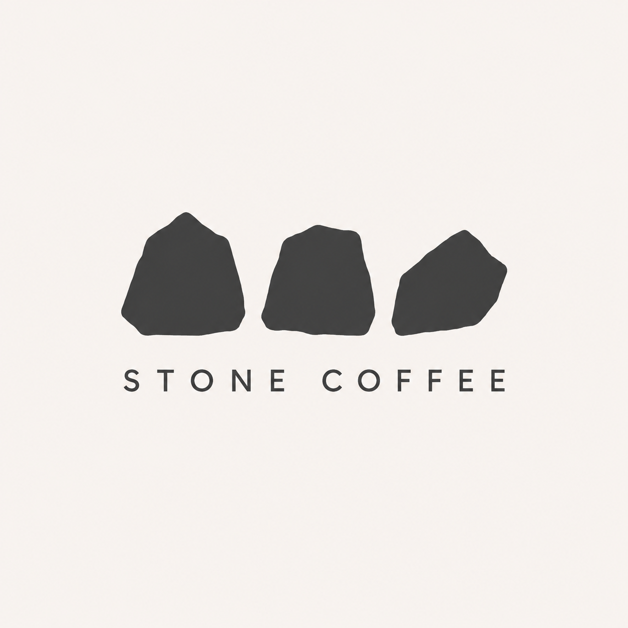
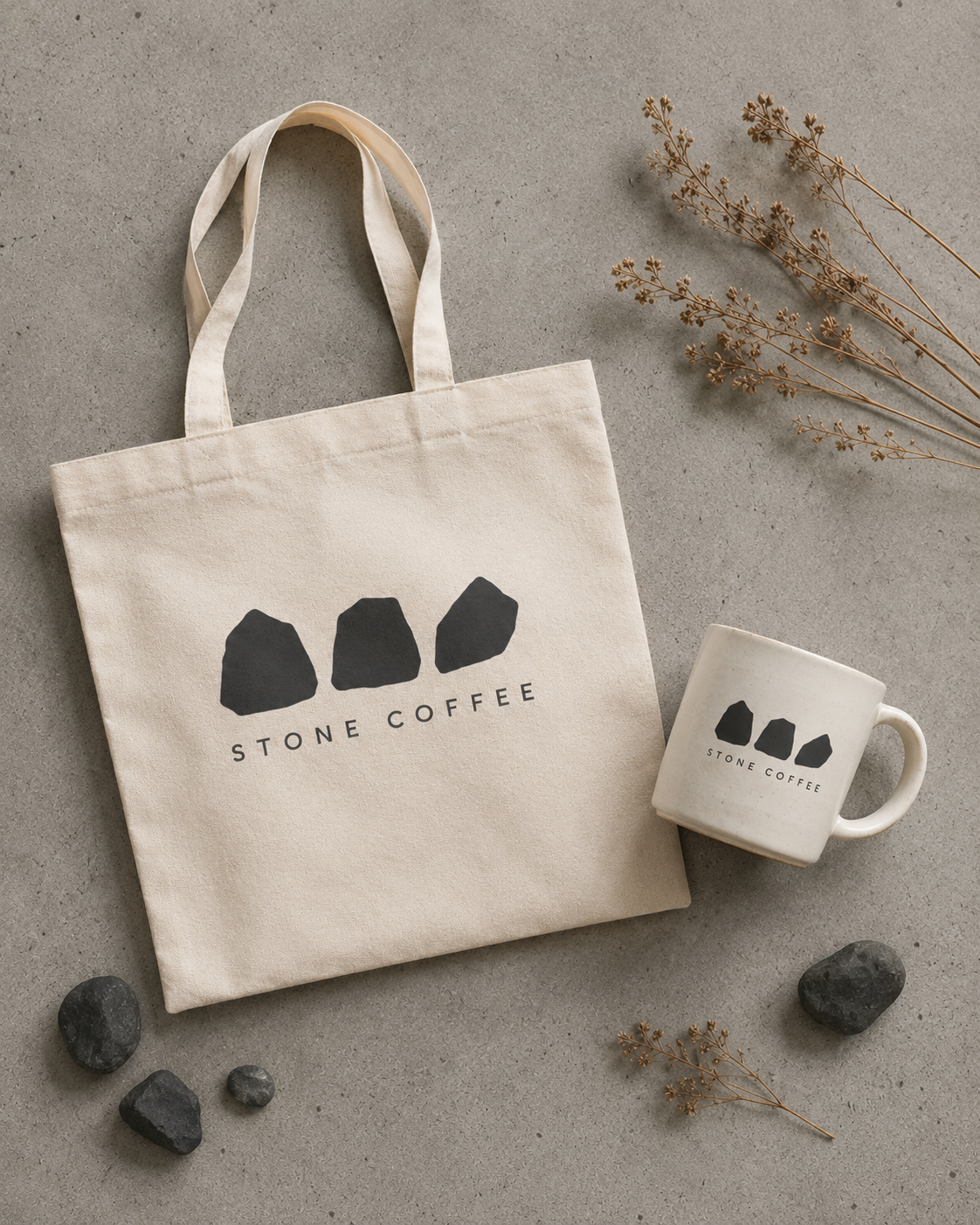
The logo is formed from three irregular mineral cross-sections. Asymmetrical and imperfect, the symbol keeps a quiet physicality instead of chasing polish.
Case study 01 · Coffee brand identity
A quiet coffee brand built against the sameness of algorithm-friendly cafe culture.
Most new coffee shops were starting to look alike: muted palettes, Instagram interiors and typefaces made for a fast scroll. They opened with queues, then disappeared from memory six months later.
Stone Coffee was imagined for people who genuinely love coffee. Not a place designed for check-ins, but a slower room where material, light and silence make the cup feel more present.
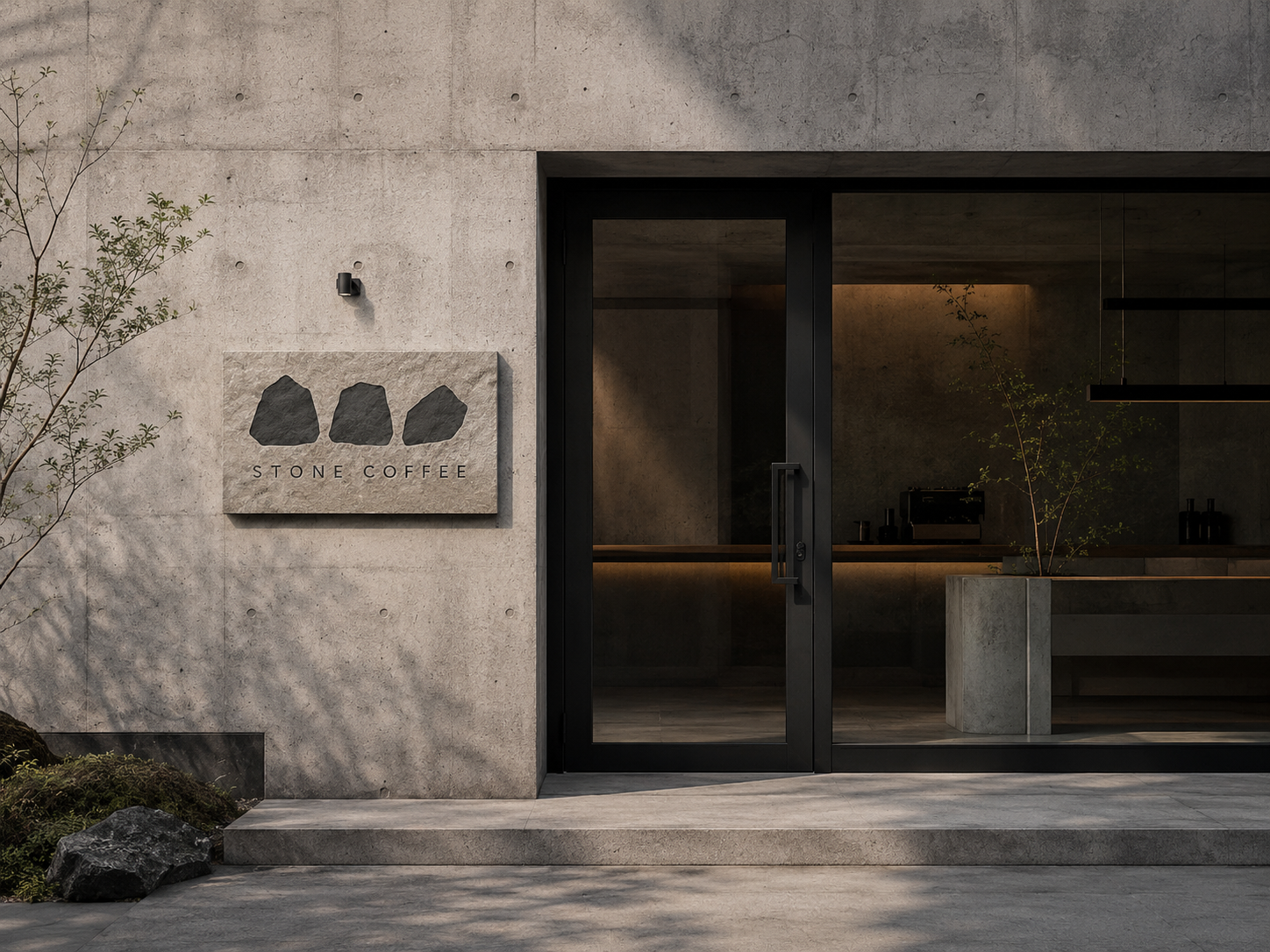
The logo is formed from three irregular mineral cross-sections. Asymmetrical and imperfect, the symbol keeps a quiet physicality instead of chasing polish.
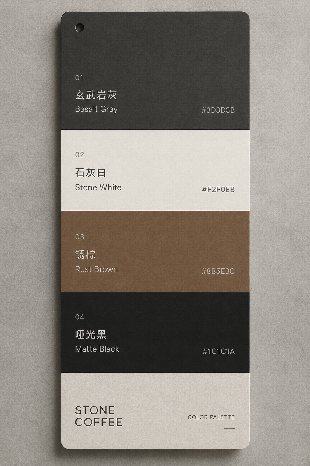
Colours are taken from basalt, concrete, rust and matte black. None of them are made to please the eye instantly, but together they feel grounded and steady.
The spatial direction uses raw concrete, natural wood and matte black. Light becomes the main design material: soft, directional and never decorative for its own sake.

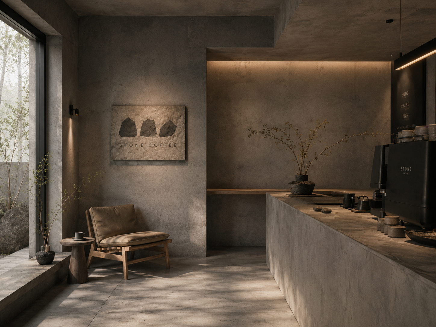
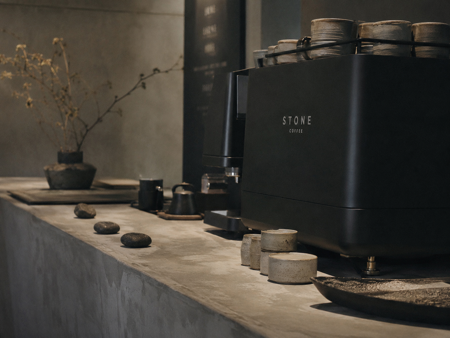
This is not a place asking to be photographed. It is a place to sit quietly and drink one good cup of coffee.