Ordered storage
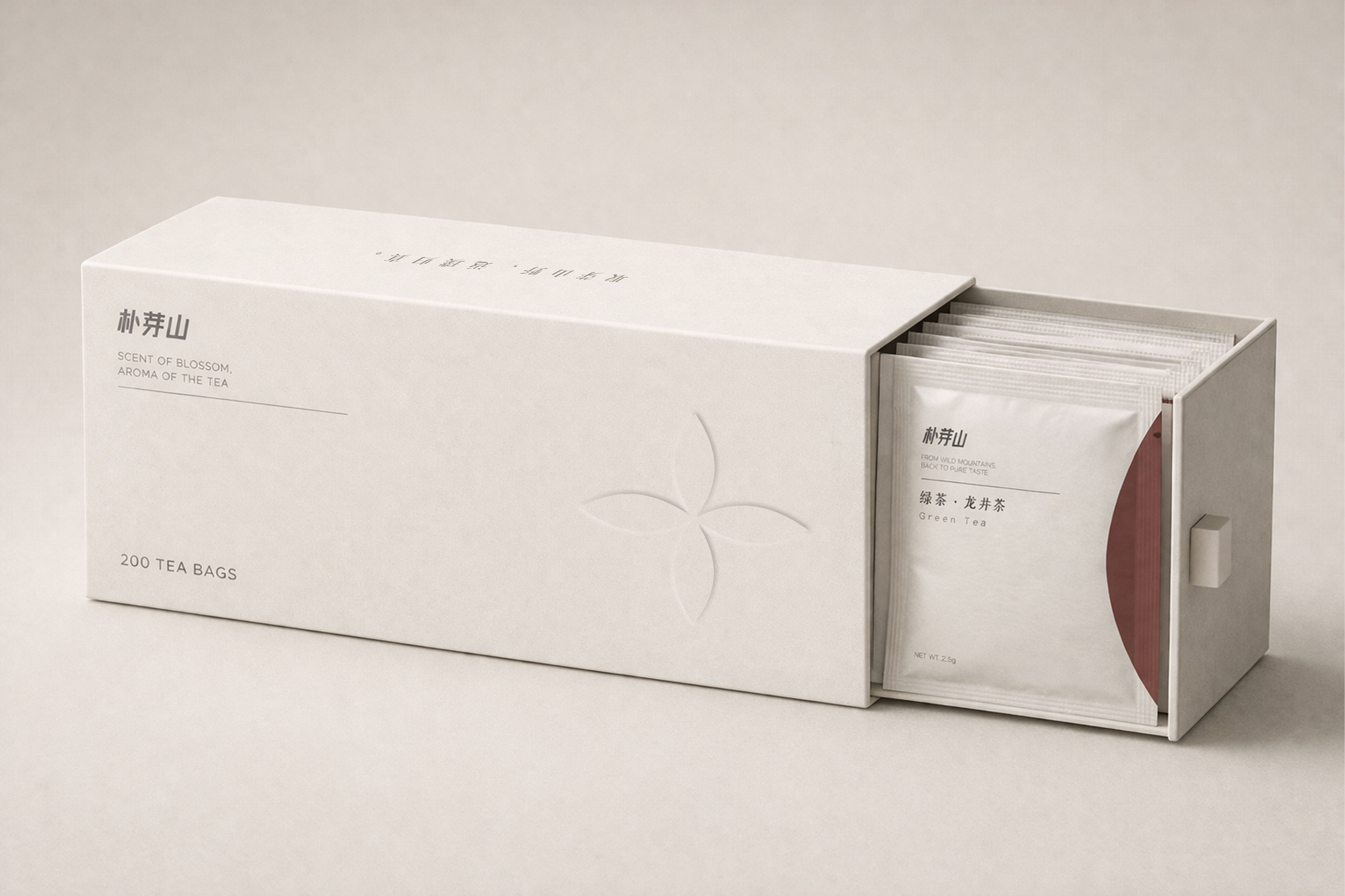
The horizontal drawer box keeps individual tea sachets neatly arranged, making selection, storage and display part of the drinking experience.
Case study 04 · Packaging design
A teabag packaging system that turns wild mountain tea into a calm, ordered daily ritual.
Built around the concept of “Mountain Tea Order,” Puyashan combines the natural origin of tea with the clarity of modern storage. Each tea variety is treated as an independent sample from the mountains, then organised within one coherent packaging system.
The design avoids heavy traditional tea symbols such as landscape paintings, calligraphy or literal tea-leaf illustrations. Instead, it uses warm white space, abstract botanical forms, soft arcs, low-saturation colour coding and tactile paper details to create a quiet modern Eastern character.
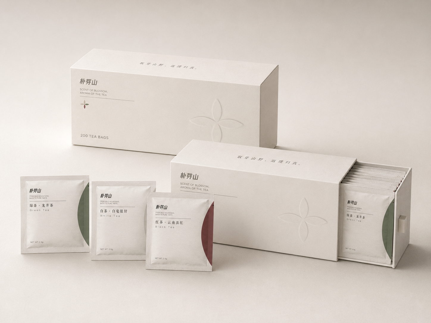
The horizontal drawer box keeps individual tea sachets neatly arranged, making selection, storage and display part of the drinking experience.
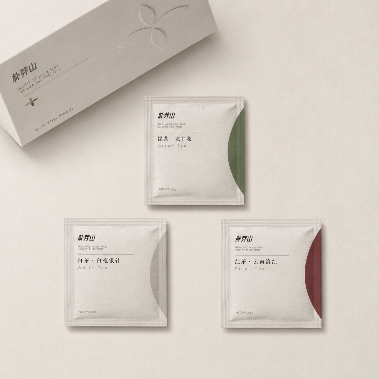
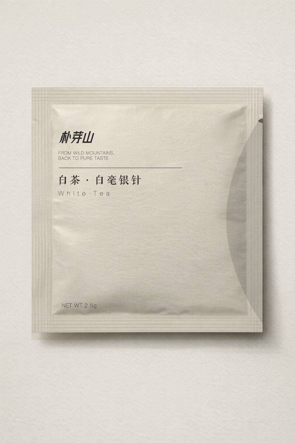
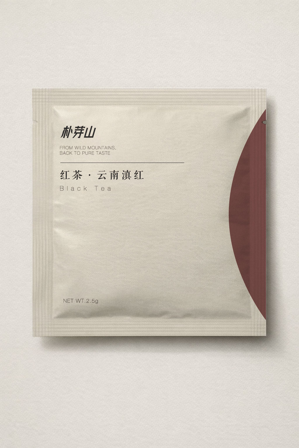
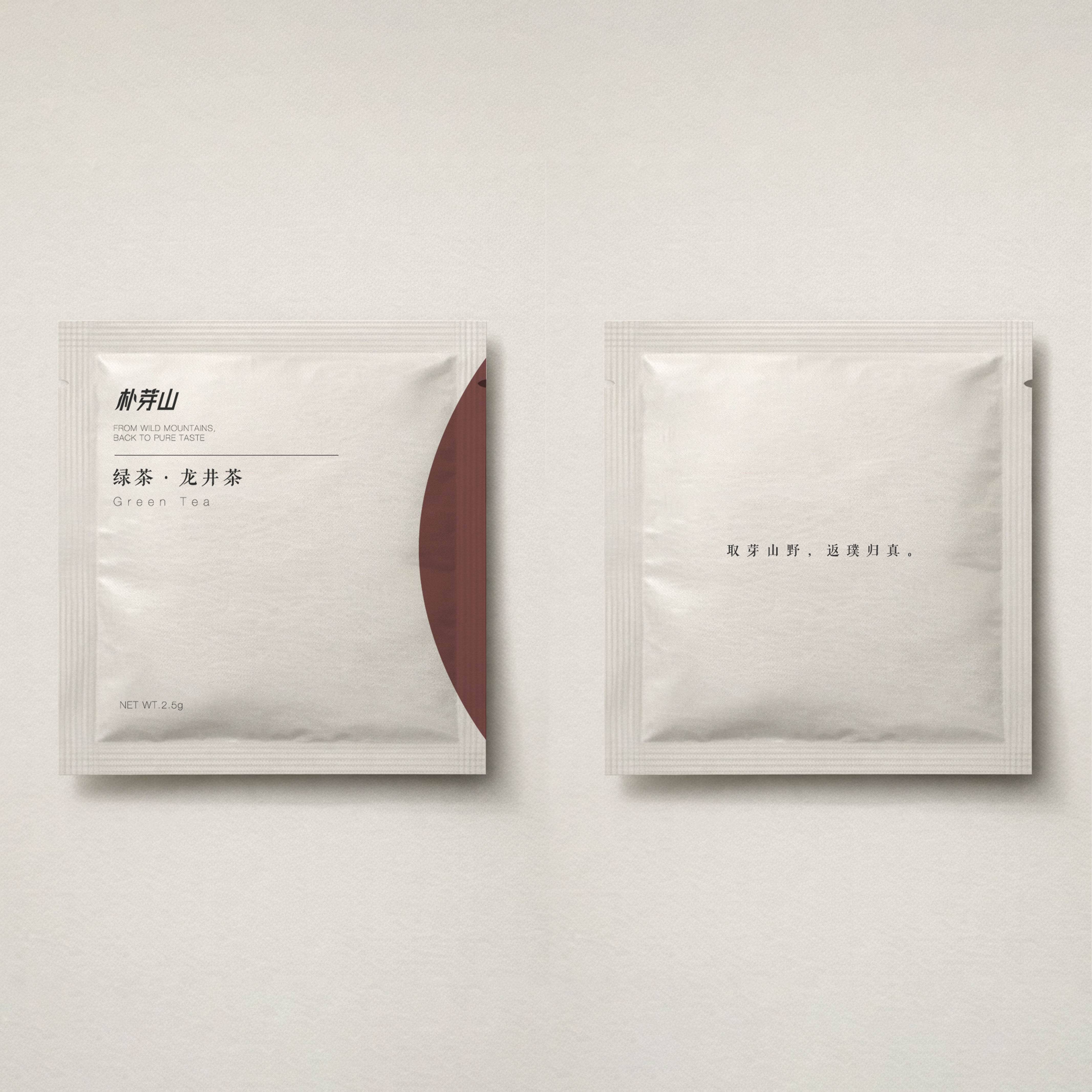
Large arc-shaped colour fields distinguish green tea, white tea and black tea while preserving a unified, low-saturation series language.
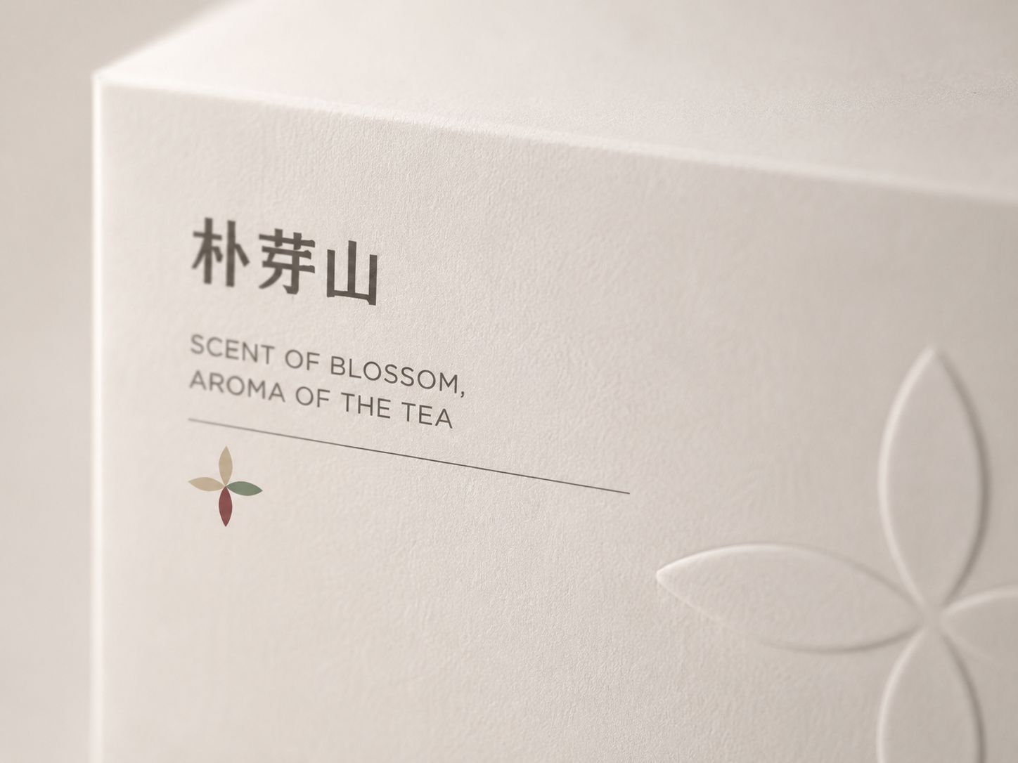
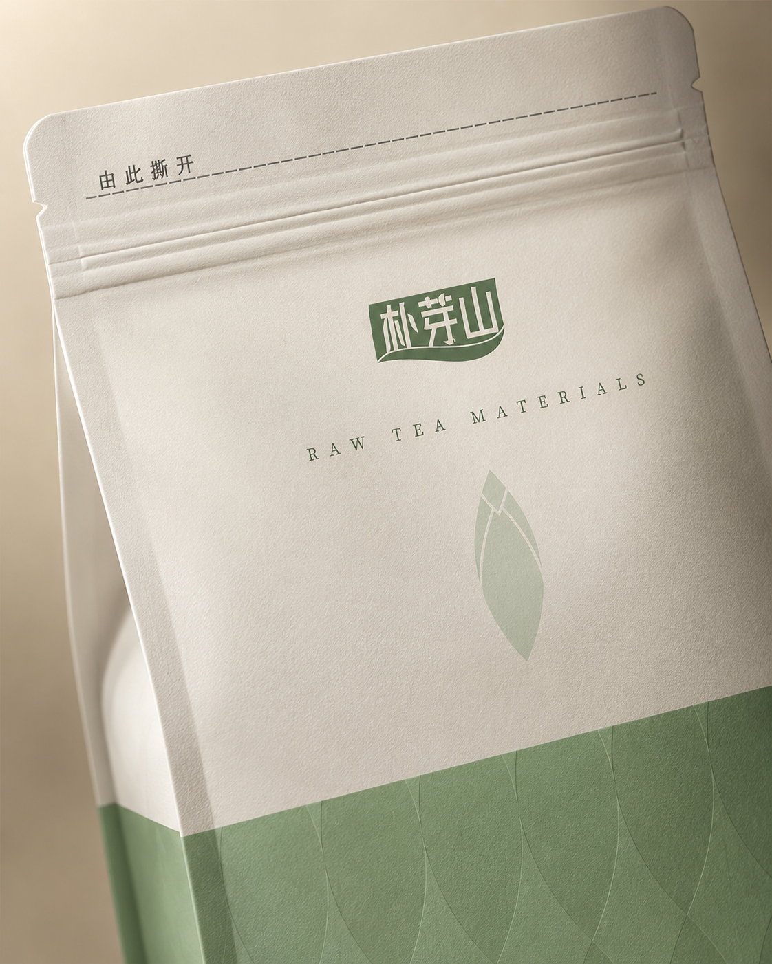
Warm white textured paper and embossed botanical marks create subtle light and shadow, allowing touch and material to carry the brand atmosphere.
Format extension
The same Puyashan visual language is extended to a stand-up pouch format for raw tea materials and larger-volume product lines. The pouch keeps the warm white base, green category field and restrained botanical symbol, while the larger surface allows more product information, brewing guidance and origin details to sit within a clearer hierarchy.
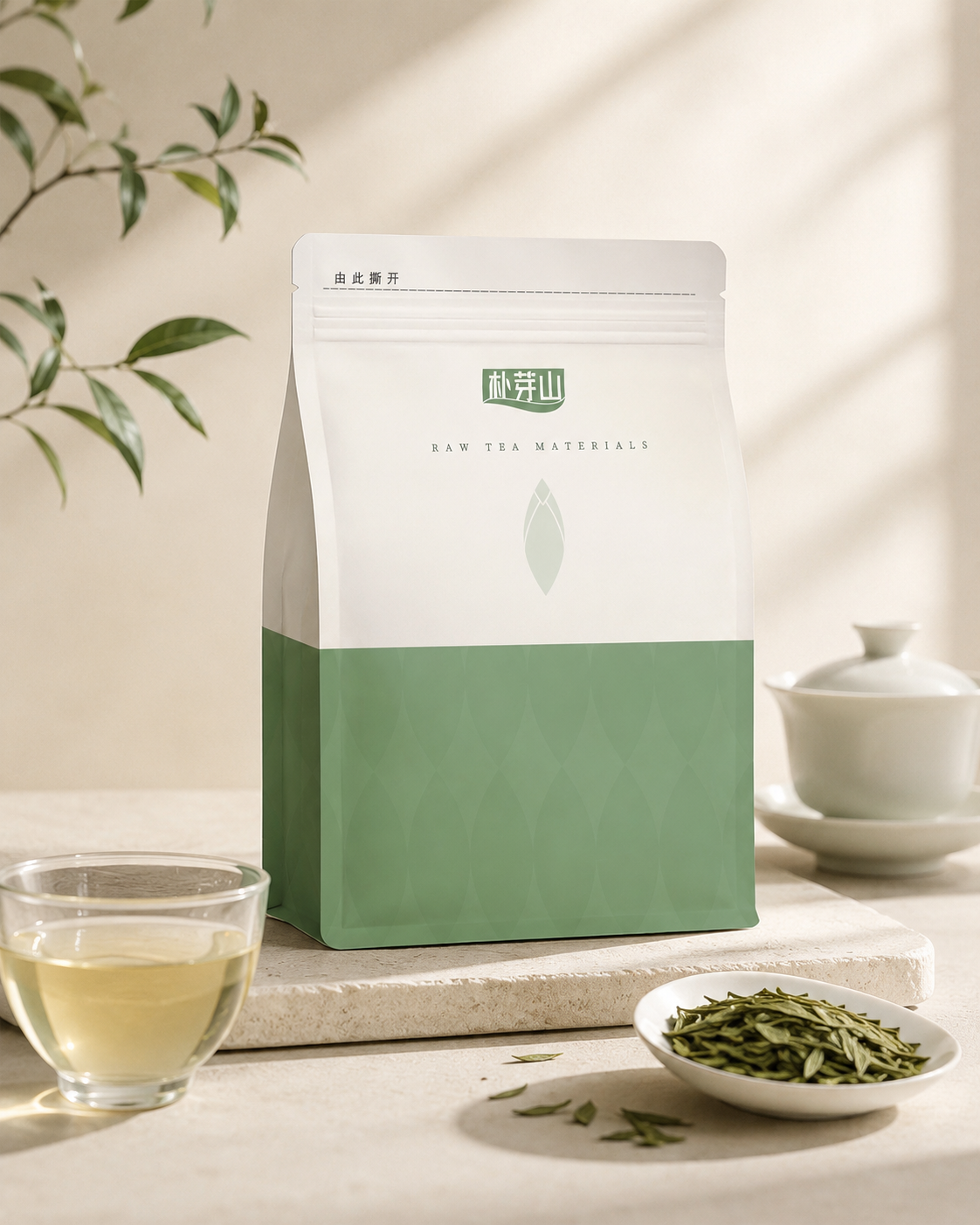
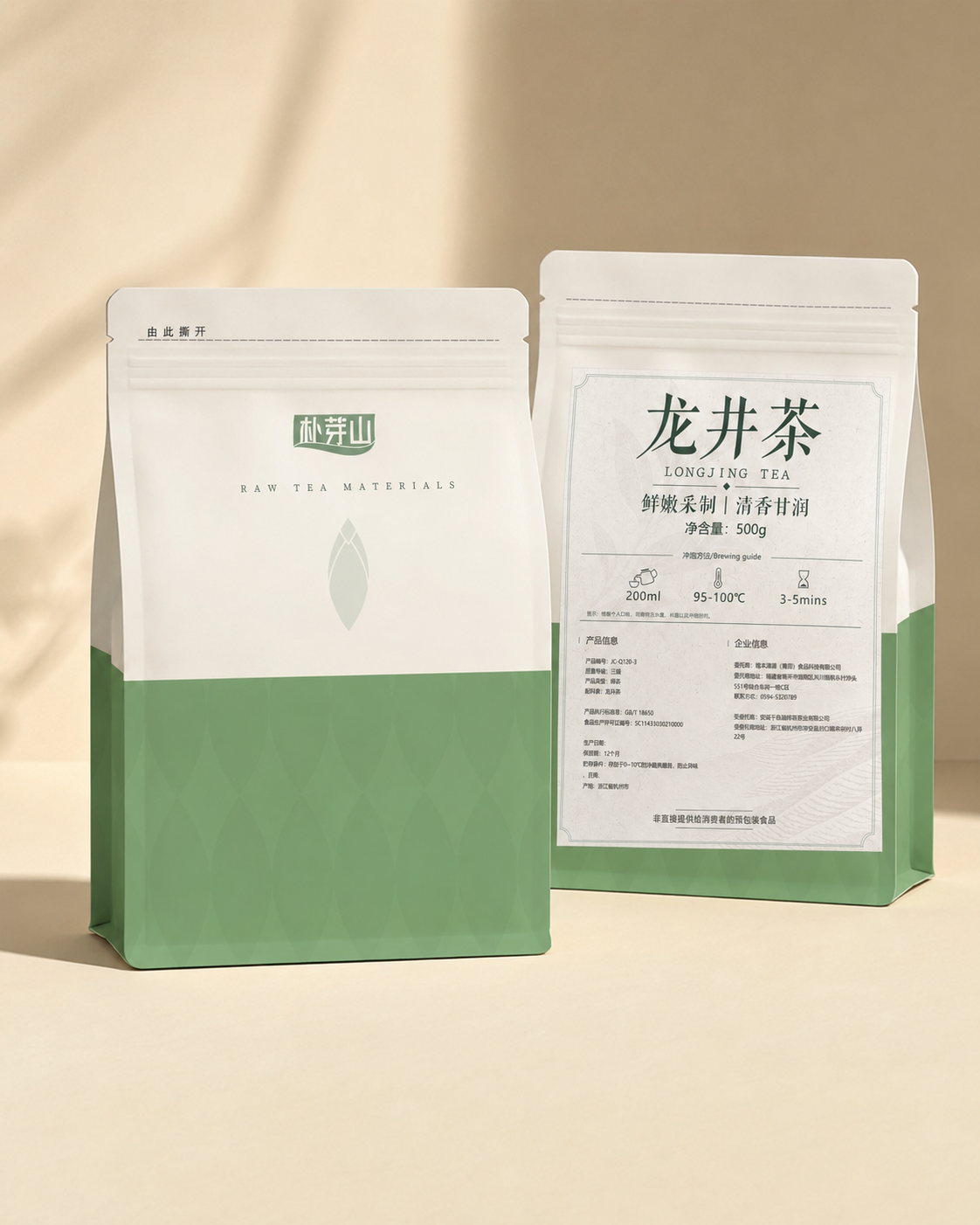
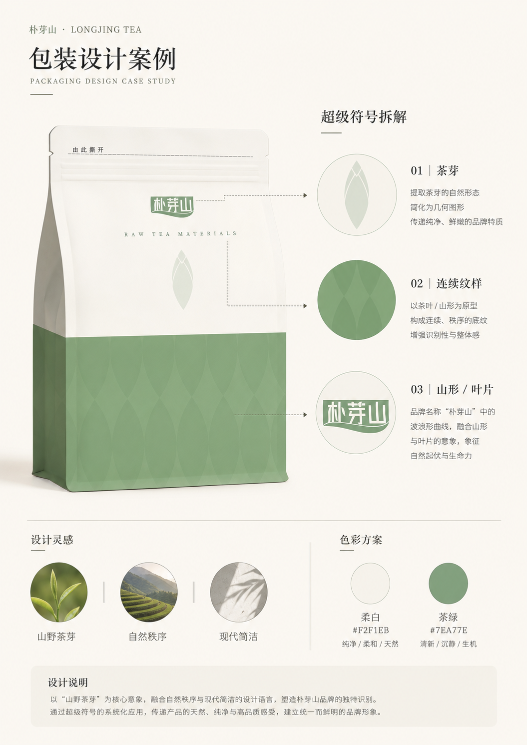
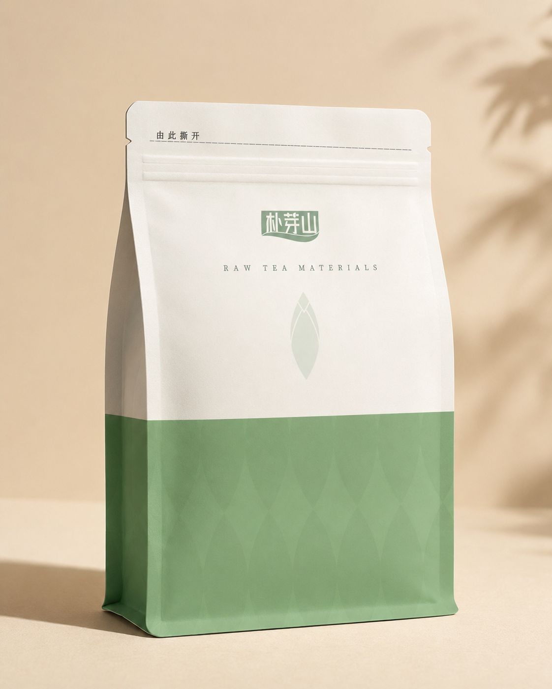
Different mountain tea flavours, organised into one clear and quiet daily tea system.