Super symbol
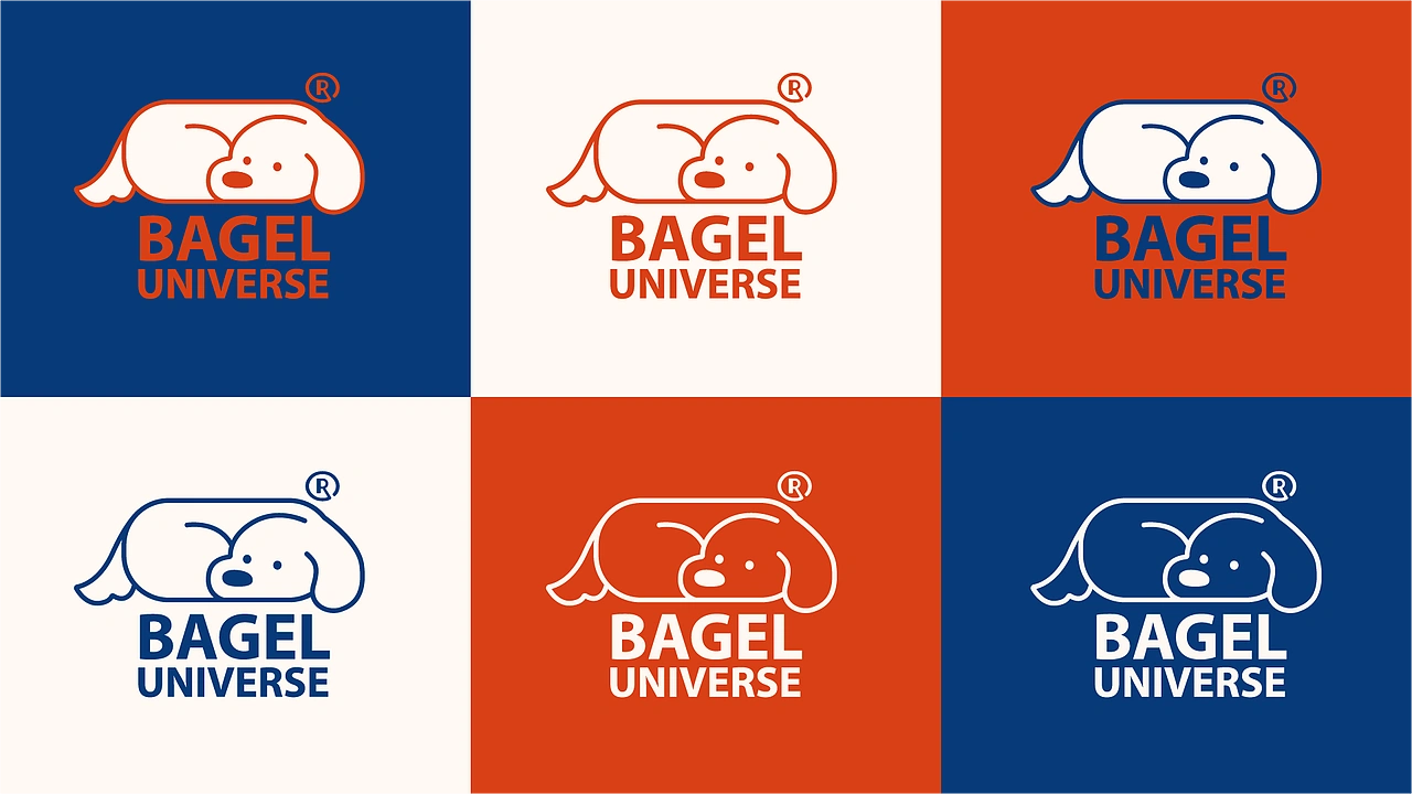
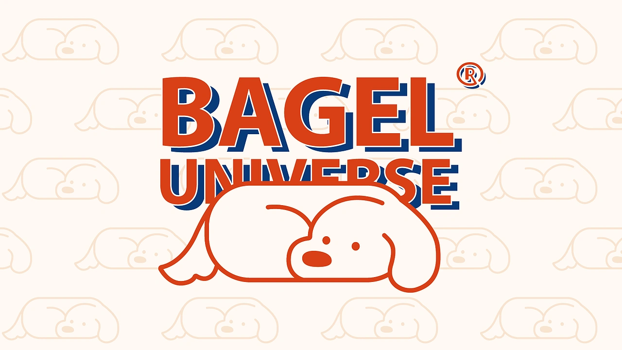
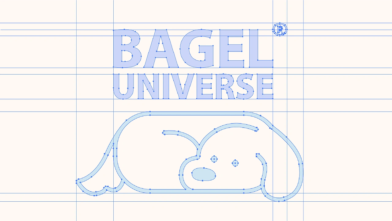
The core dog character merges the rounded softness of a bagel with an instantly recognisable relaxed posture, creating a friendly and memorable brand mark.
Case study 02 · Brand visual identity
A playful lifestyle bagel brand built around freedom, upward energy and independent living.
Bagel Universe is imagined for a younger audience who see food as part of a lifestyle, not just a purchase. The brand moves away from the soft and delicate codes often used by bakery brands, turning the bagel into a relaxed, expressive everyday symbol.
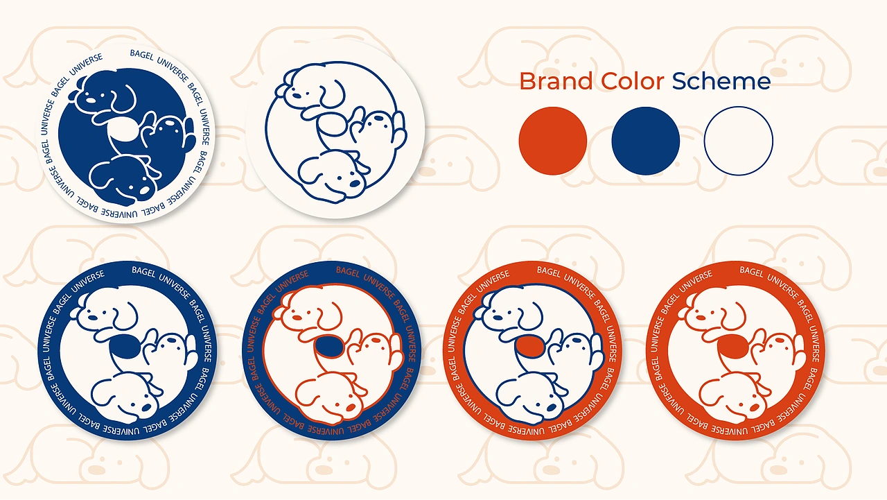
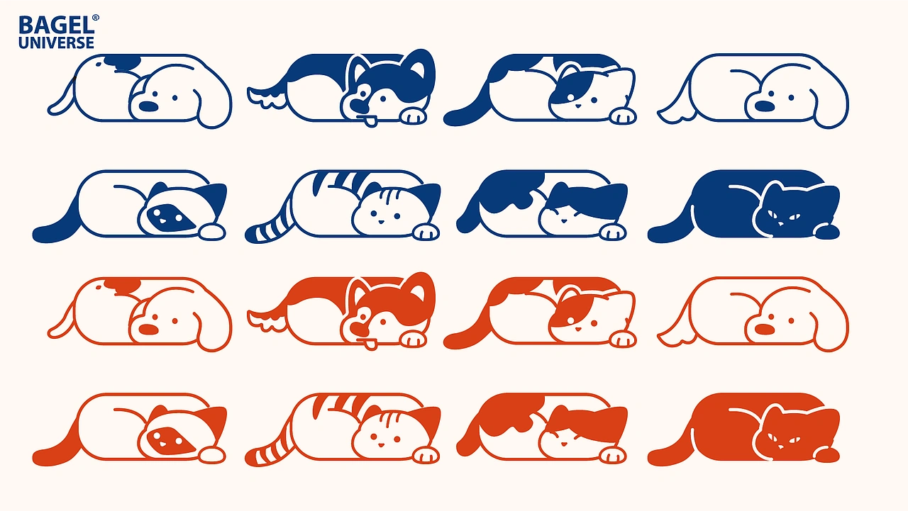
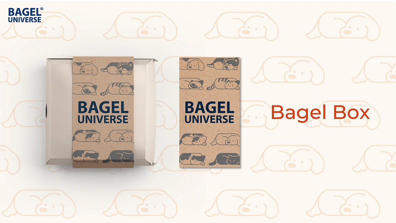
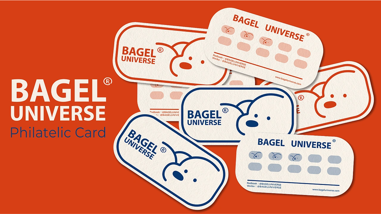
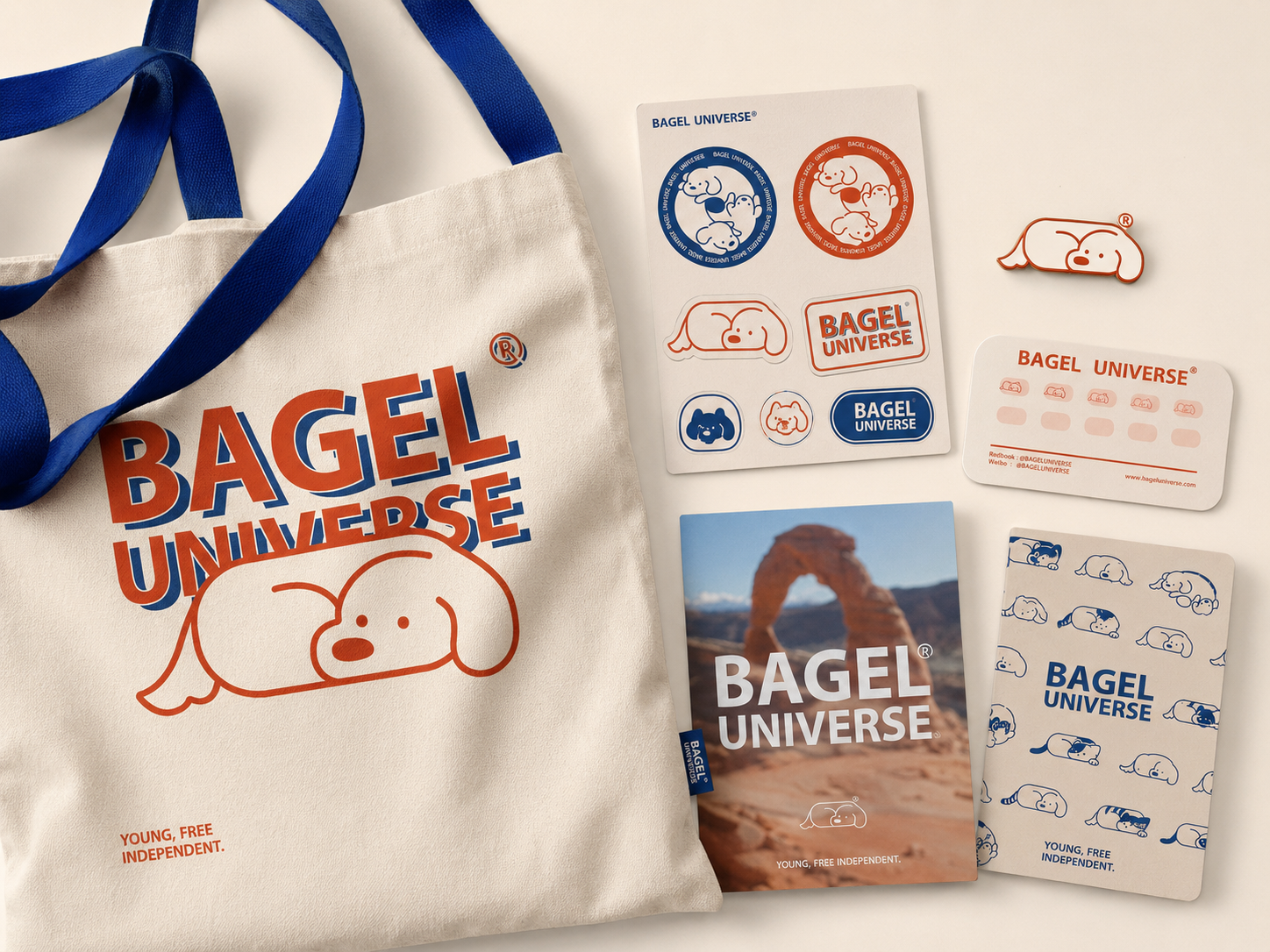
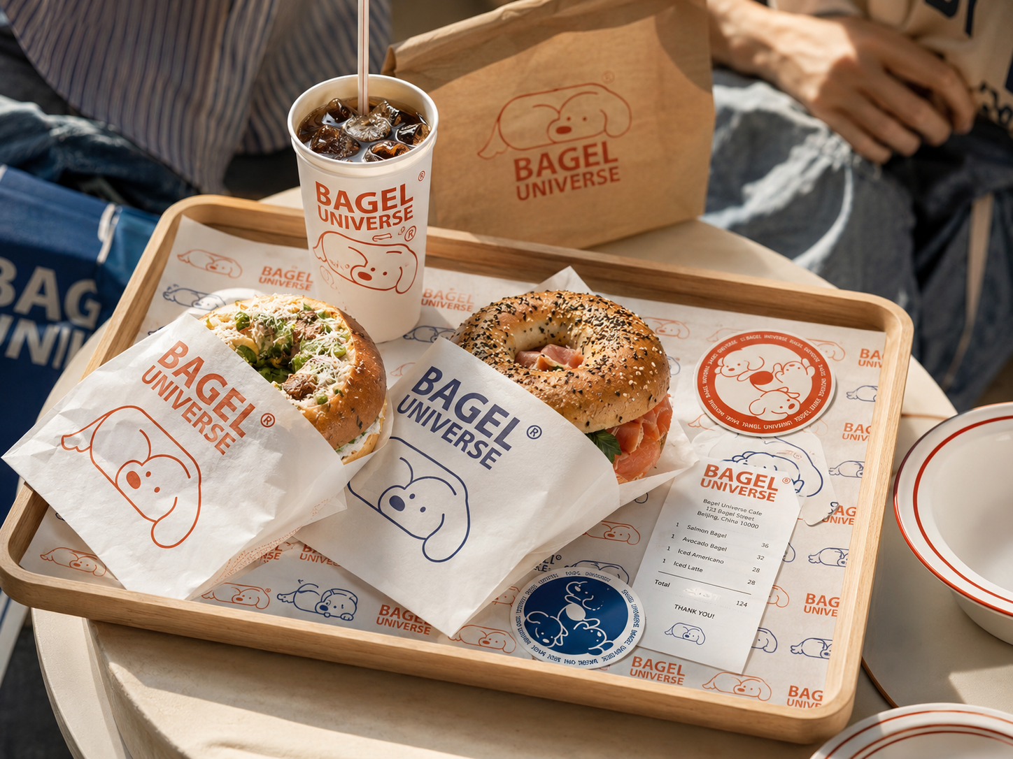
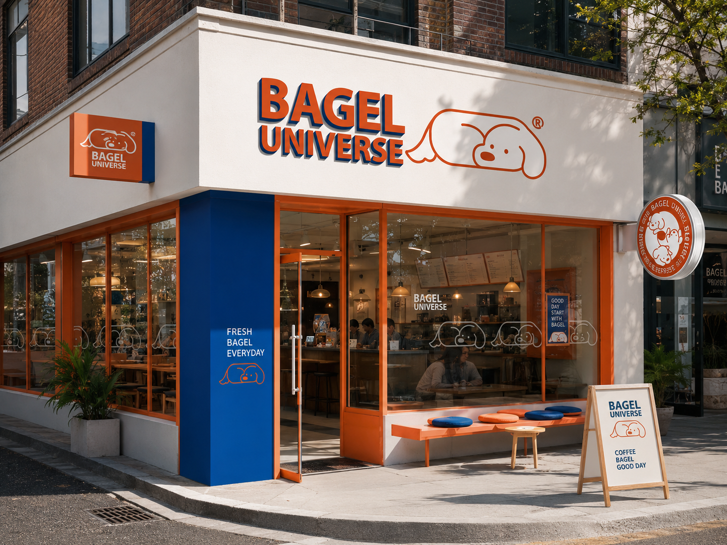
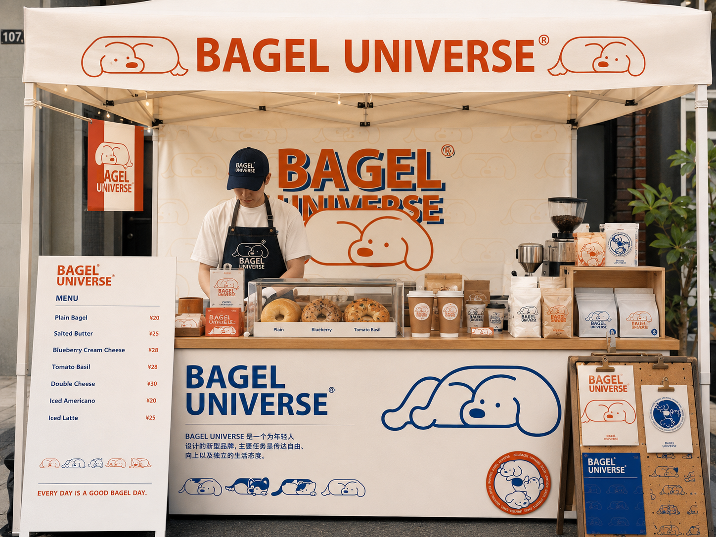
The identity is led by a lazy dog character whose rounded body borrows from the soft circular language of bagels. Through additional animal characters and poses, the system grows into a small visual universe designed for packaging, retail, merchandise and social sharing.
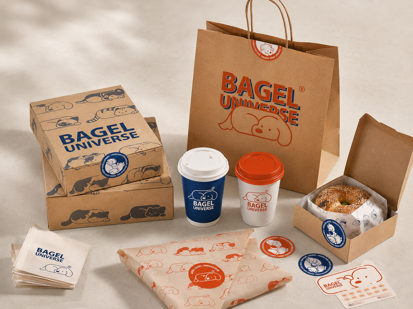
The core dog character merges the rounded softness of a bagel with an instantly recognisable relaxed posture, creating a friendly and memorable brand mark.
Different animals and poses extend the brand beyond a single logo, making the identity more flexible for content, merchandise and seasonal campaigns.
Saturated orange-red, deep navy and warm white balance retro warmth with a bold, young visual attitude.
Young. Free. Independent. Living in your own universe, in your own way.